April 1, 2018
MWeb Brings Skills to the Genre
 MWeb Icon
Product: MWeb
Price: $14.99
Loren of ldstephens asked for a review of MWeb. So here goes.
MWeb is a surprise. It is a deep product which improves on both Ulysses and Bear in some areas and brings some unique skills to the Markdown editor genre.
It is the usual three-pane Markdown based text editor. Similar to LightPaper, TextNut - A CommonMark editor for Mac, Bear - Notes for iPhone, iPad and Mac or Ulysses to name a few. This category is a competitive category in the macOS marketplace.
I have myself covered a whole host of them:
- WonderPen Is a Tad Short on Wonder
- TextNut Reimagines Zen Mode
- Bear Is My App of the Year
- The Prodigal Son Returns to Ulysses
- LightPaper: One App for Your Markdown Needs. With a Few Nifty Extras.
MWeb does a lot of things well and hasn’t gotten the attention it deserves in the marketplace. It is a product which is getting lots of developer love and is steadily being improved giving me another reason to write about it. I am surprised by the feature set of MWeb and am excited to tell you about it.
Features Galore
MWeb supports the Github-flavored Markdown variant of the Markdown flavors. That means it supports TOC, Table, Fenced code block, LaTex, Task lists, Footnotes, etc. Github-flavored Markdown(GFM) is a full-featured Markdown variant. This makes the product different from both Ulysses which barely supports Markdown and Bear which is struggling to take the product beyond the basic Gruber Markdown.
MWeb is a native macOS application. Thus it is fast, stable and intuitive to the Mac user. It supports features standardized on the macOS like multiple tabs and text expansions (with some caveats).
MWeb has an iOS version, but I have not tested that.
Library to Manage Your Files
Like Ulysses, MWeb gives you two different libraries to work in.
- Library (⌘L), contains the files you create in MWeb’s Library. This is a SQL library which adds some efficiencies like cross-note linking. Bear also has a SQL backend. The difference is that if you explore the folder that MWeb terms its Library, it will contain a folder of your files in plain text format. You have access to the plain text files if you want to access them in another program on your iOS devices through any old text editor. Bear does not give you this opportunity.
- External (⌘E) is a collection of files within folders that you ask MWeb to manage. These are the collection of plain text files that are residing on your hard drive. This is similar to the External files maintained by Ulysses. There are two big differences between the way external files are maintained by Ulysses and MWeb. Ulysses has a tendency to change the external files that you ask it to maintain. Inline links become reference links if you do not explicitly stop Ulysses from doing stupid things. MWeb reads them as plain text files and doesn’t change these files unless you specifically edit them. The second major difference is that Ulysses only supports a subset of its Markdown syntax for external files. MWeb doesn’t make any such distinction. All files have full support for GFM.
Interface To Live In
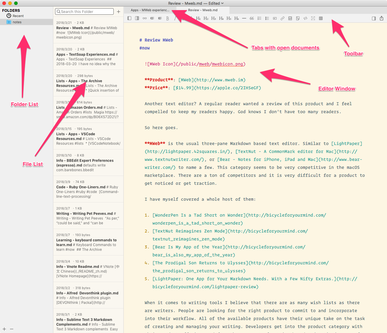 MWeb Interface
I am going to highlight the interface through the External Library, simply because I use that a lot more. I like having my text files in assigned folders and having them accessible through any text editor I fancy at the moment.
On the left is the listing of folders that you have added to the External Library. On it’s right is the list of files in the folder. The main window is the Editor window. MWeb supports the macOS tabs and they show up at the top of the editing window.
Toolbar. MWeb has a toolbar. This is the most discordant feature of the writing environment. The icons are useful in that they help you write Markdown, however, the product is not geared towards the novice Markdown writer. The product features are geared towards people who are comfortable with taking their Markdown based writing beyond the scope of the simple Markdown editor. Examples include the support for LaTex, code highlighting and the whole suite of features from GFM. The toolbar is specially distracting in full screen mode. There is an option to hide the toolbar and I seem to be using that all the time. I have a Keyboard Maestro macro assigned to a typed string trigger which lets me turn the toolbar on and off.
 Keyboard Maestro macro to toggle toolbar
Since the command does not have a keyboard command assigned to it, my Keyboard Maestro macro gets a lot of use. The good news is that the toolbar commands almost all have keyboard commands assigned to them. Learn them and you don’t have to use the toolbar at all.
Dark Mode. MWeb implements a Light Mode and a Dark Mode. You have the option of assigning a specific theme to each of these options. I find myself using Solarized Light in Light mode and Solarized Dark in Dark Mode. Again, this switch between Light and Dark Mode doesn’t have an assigned keyboard command, and a Keyboard Maestro macro with a typed string makes this easy to access.
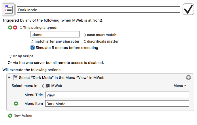 Keyboard Maestro macro to toggle dark mode
Document Outline (⌘7). MWeb provides you the ability to look at the outline of your document and navigate through the various headers in it. You click on the header you want to get to and you’re taken to it. This is useful when you have a long document you are working on.
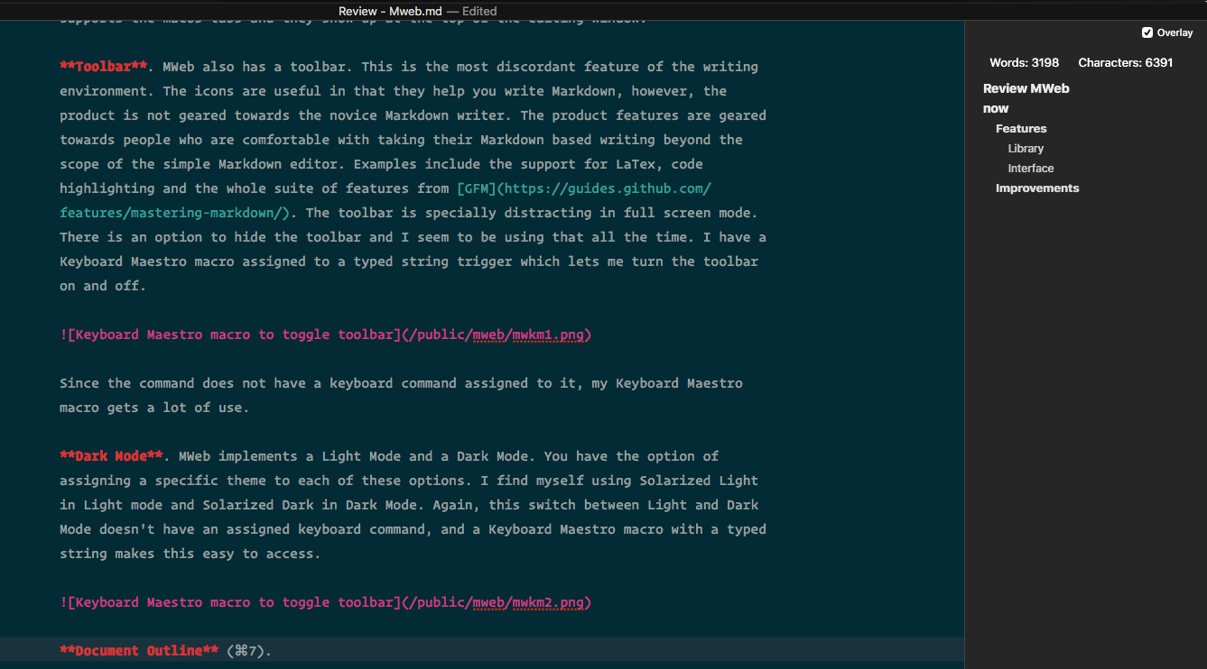 MWeb Document Outline
Writing Environment
This is the most important part of a Markdown based text editor. How does the Editor help the writer? This is what distinguishes a Markdown based product from a simple text editor.
Markdown Support. MWeb supports the full suite of GFM Markdown syntax.
Links (⌃⇧L). MWeb supports links in that it lets you press a keyboard command and it inputs the syntax for a link. If you highlight the word or phrase that you want to turn into a link, select it and press the keyboard command ⌃⇧L, the selected word or phrase gets surrounded by square brackets, a set of brackets are appended to the square brackets with the cursor in the middle waiting for you to fill in the URL. It is useful. I would have liked it if the feature was a little more developed. If I have an URL in the clipboard, I want it automatically inserted surrounded by brackets. I should also be able to drag an URL or copy/paste an URL to a highlighted word or phrase to make proper Markdown formatted links.
Lists. MWeb supports both unordered(⌃U) and ordered(⌃⇧O) lists. It auto-completes the lists syntax making it easy to make them. You can highlight a block of lines and press the specified keyboard command to get the kind of list you want.
Table Editor. This is a feature which Ulysses and Bear have failed to include in their offering.
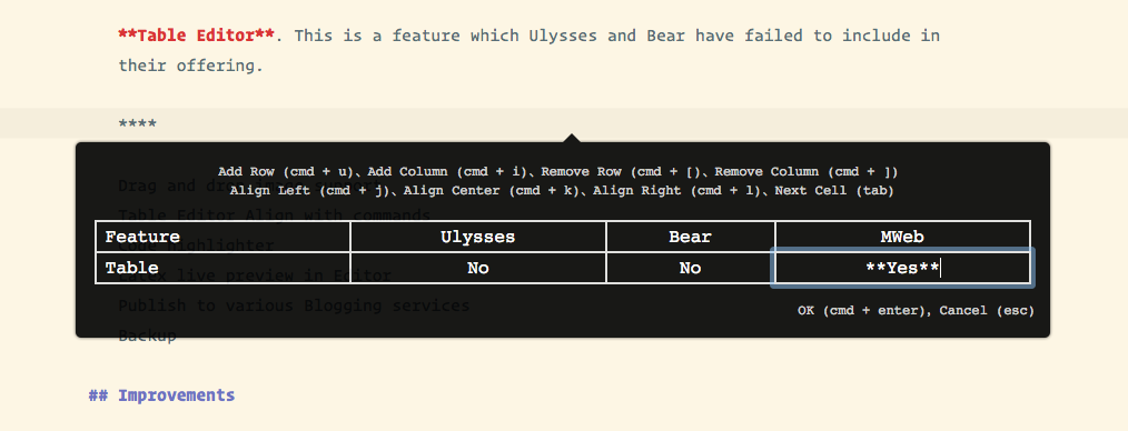 MWeb Table Editor
The Table Editor in MWeb is well implemented and it is useful for those of you who need tables in your writing. I am amazed that this feature is still missing in the two prominent note-taking applications in the marketplace. MWeb’s table editor is comparable to the one in Typora. These two are the best in class when it comes to tables support in Markdown based text editors.
Code Highlighter. Another feature which seems to be difficult to implement for Ulysses and is well supported by MWeb.
Drag and Drop Image Support. You can add images to your document with simple drag and drop. It is integrated into the export to several blogging engines.
LaTeX. You can live preview LaTeX code in your document. Something useful to those of you who are a tad geeky.
Publish to Various Blogging Services
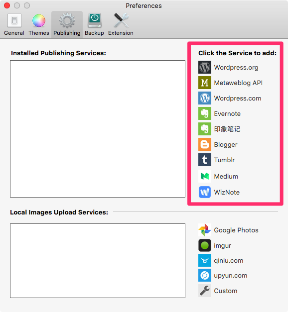 MWeb Blogging
MWeb supports publishing to a whole slew of blogging engines. It is not a feature which is particularly useful to me. I blog at Blot which means that I use plain text files in an assigned Dropbox folder. Don’t need a blogging application. It might however be useful for some of you.
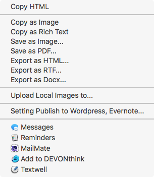 MWeb Export
MWeb provides you the usual tool chest of export formats. You can export your document to Rich Text, PDF, HTML, RTF or .docx files from the external libraries. When you are in the internal library you can export, in addition, to Markdown text files. You are not burdened with any proprietary formats in MWeb.
Backup Your Writing
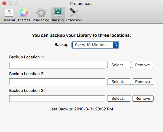 MWeb Backup
A writing application needs to have a backup routine in-built and MWeb doesn’t disappoint. Three unique locations to backup your files. Gives you peace of mind. I approve.
Suggestions for Improvements
- Make it easier for the user to insert links. Highlight a word and press a keyboard command to surround the highlighted word in square brackets and copy the URL in the clipboard next to it after surrounding the content with brackets.
- Support macOS conventions. I can set up text completions in the System Preferences. Two spaces equal to a period (this is supported). Start every sentence with a capitalized letter (this is not supported).
- Give me an option to convert amongst different list types. Ordered, unordered, task list and plain text. A toggle command would be ideal.
- The help video is great. It gives you an overview of the features, but please add an audio track to it.
Conclusion
MWeb is a surprise. It does a lot of things well. It is a full -featured Markdown based text editor which deserves more attention than it gets. These are the things I love about it:
- Full support for Github Flavored Markdown.
- No proprietary file format. Just plain text files.
- Table Editor.
- Support for macOS conventions.
- Support for a wide range of keyboard commands.
- Continued development.
If you are looking for an application to live in with your Markdown files, MWeb is a competent and cheaper alternative to both Bear and Ulysses. It might not be as pretty but it is more capable a Markdown editor than it’s competition.
I recommend MWeb heartily.
I was provided a promo code by the developer for the macOS App Store version.
macosxguru at the gmail thingie
MWeb
Markdown
text editor
macOS
March 14, 2018
The Archive Adds Zettelkästen to the Note-Taking Arsenal
 The Archive icon
Product: The Archive
Price: $19.99
Note-taking Demystified
There are many reasons why you take notes:
- Information Gathering. You come across something interesting about a subject matter you are interested in and make a note of that. This can take the place of a whole page/pages in a web site and you want to keep a pdf file of the content. You might want to note the URL of the web page and your thoughts about the content of the page. You take notes because you are engaged in the process of gathering information about a topic.
- Learning. There is the need for note-taking when you are learning about a subject. You read about the subject and you want to synthesize the learning and you want to keep this synthesized information for further exploration or as a memory bank item.
- Creating. Sometimes your note-taking deals with the creation of knowledge. You learn new things, you react to it. You collect various pieces of information and you bring different perspectives to the information and try to distill it into a web of knowledge that is unique and yours. Unfortunately this process doesn’t happen in one shot. It is a progression and the notes you take on the subject grow and mutate over a period of time, or over a lifetime.
Irrespective of the motivation behind your note-taking, there are some questions which are central to this activity:
- How easy is it to take notes?
- How easy is it to get back to a note?
- How to build on the knowledge of your notes?
- How easy is the search function?
- How do you link the notes to each other to create a web of knowledge on a subject?
- How do you ensure that this body of knowledge is going to stay with you for the rest of your life and not be dependent on any particular piece of software being available?
Many people have tried to understand and provide answers to these questions over the years. The Zettelkästen Method is one answer to some of these questions.
Luhmann, the primary exponent of the Zettelkästen Method is the first one who used a hypertext approach and propagated a system that worked with paper. His big contribution to the system was to assert that every individual note had a fixed position. He eschewed the use of categories which would have allowed the notes to move freely within the categories. Every note had a fixed ID, every subsequent note had its own fixed ID, if they were related to a previous note, the ID would be build on the previous note. For instance, the initial note might have had an ID of 5. The subsequent note would have the ID 5a. The next note building on this would be 5b, if it branched off in a different direction it would be 5a1. And so on.
This led to the first of Luhmann’s principles: A flexible branching capability. The archive grows along the train of thoughts organically and is not pre-determined by a system of fixed categories. Categories are problematic because you have to choose them before you start, but at that point you do not have a clue where the journey will be taking you. (If you knew in advance, it would not be creative knowledge work.)
A body of knowledge which grows over time has to build in some sense of connection between the notes. For the notes to be useful, they have to link into a pertinent web of interconnected information. Which leads us to the second of Luhmann’s principles, connectivity.
With IDs and fixed positions, you can link from one note to another. If the position in the archive changes, the link would break and you couldn’t find the note again. Remember that in the case of Luhmann’s notes we are talking about paper. (Luhmann had 66,000 notes in his second archive, by the way. No chance of finding something that got filed at the wrong position.) In the digital realm, this is important when you have a collection of notes on different topics. The notes are connected by their topic or area of focus and it helps to have the ability to connect them when creating them to build a web of knowledge which leads you to understand the subject under scrutiny.
The third principle is to have a register. This was the first entrance for Luhmann if he wanted to get started communicating with his archive. This was in the form of an index. In the digital world, this is not that important. We have full text search and can search for tags directly in our archive.
If you want to read a translation of Luhmann’s article “Kommunikation mit Zettelkästen”, where he talks about his method, written by Manfred Kuehn, follow this link: Communicating with Slip Boxes by Niklas Luhmann.
The Archive Attempts to Tackle Note-Taking
The Archive owes a huge debt to nvALT. The developers acknowledge that debt explicitly. The Archive is nvALT improved.
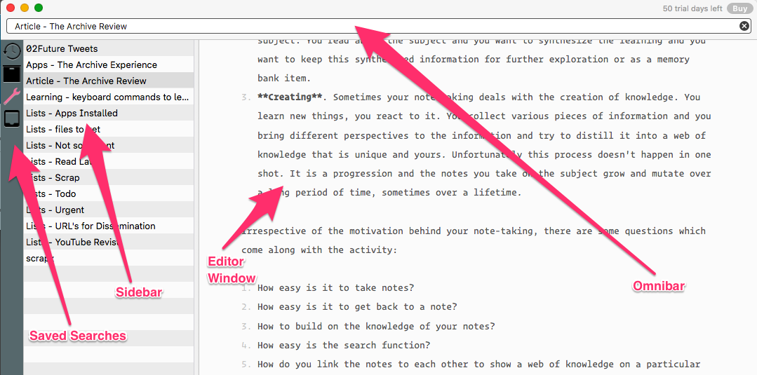
 The Archive Window
The Archive has four main components:
- The Omnibar. This is the place you type to search and create your new notes. It is a dual-use window to search your archive, and create new notes. Type something in the Omnibar and the application searches through your archive for the words you typed. A subset of your notes show up in the Sidebar, listing the notes that contain the words you typed. The Omnibar is also where you type the name of the new note you are creating. Just type the name of the new note and hit enter. You are now ready to add the contents of the note in the Editor window.
- The Editor. This is where you write your note. It is a Markdown compliant editor. Supports Gruber’s Markdown.
- The Sidebar. This is the list of your notes. It is dynamic in the sense that it changes depending on what you have on the Omnibar. If the Omnibar is empty of content, this is the list of all the notes in the folder of the archive. If the Omnibar has some content, the Sidebar contains the files which contain the words in the Sidebar.
- Saved searches. In The Archive you have the ability to save frequently used searches and they show up on the side.
The Editor
This is where you are going to spend most of your time in this program. It is Markdown compliant. It supports Gruber’s Markdown. Unfortunately, the technology has moved on from that basic implementation and now there are many different flavors of Markdown. I would have preferred support for CommonMark. Markdown support in these new incarnations like CommonMark, MultiMarkdown, and Github Flavored Markdown, has been extended to tables, table of contents and footnotes. The implementation of Markdown in The Archive does not support any of these enhancements to Markdown. This hampers the editing function in The Archive. The good news is that The Archive includes an option to edit the note in an external editor (⇧⌘E). So in a note which has the need for advanced Markdown support, I use the option to
edit the note in my designated editor, Composer. I edit in Composer and use The Archive to manage the files. You have the ability to designate your favorite Markdown editor in the preferences as the external editor.
The Archive is a nice place to write in. The editor supports syntax highlighting for Markdown and does have some nice touches like typewriter scrolling built in. I would have liked extended support for writing Markdown. For instance, the program supports automatically completing the brackets used in Markdown but it could add support for some features that make writing Markdown links easier:
- Highlight a word and copy an URL from your clipboard to make that word a link.
- Highlight a word and press a keyboard command to put the word in brackets and let me add an URL surrounded by brackets.
The editor lets you do away with the sidebar when you are writing (⌃⌘S). That gives you a barebones editor window. It is useful if you want to limit distractions and write in The Archive.
Saved Searches
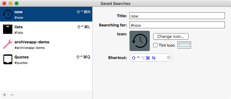
 Saved Searches
If you have a fair few notes (my archive of notes contains about 2800 notes), you are going to be periodically performing searches on the notes. The Archive gives you the ability to save searches you regularly perform. They show up in the leftmost panel. You can assign icons to help you identify them. There is a pop-up indicator panel if you hover your mouse cursor over the items. You can assign a keyboard command to a saved search. This is an example of the attention to detail which makes The Archive an absolute pleasure to use.
Saved searches makes it possible for me to build a repository of some of the repetitive searches that I find myself doing when I interact with my collection of notes. Saved searches are analogous to smart folders in the macOS world and are an useful addition to the act of interacting with my notes.
The Archive Improves on nvALT
I love nvALT. I have been using it for years. Brett Terpstra and David Halter, building on the core of Notational Velocity, have created a product which has grown to define note-taking on the macOS platform. The Archive improves on nvALT in several ways.
The Ability to Use Multiple Archives
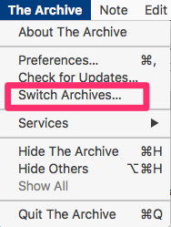
 Switch Archives
nvALT has always been constrained in that it supports one folder of notes. Changing the archive of notes to a different one required a fair amount of work. The Archive gives you the ability to have several archives of notes, and the process of switching between them is convenient and quick.
Choose Switch Archives… from the The Archive menu and you get to select the folder containing a different archive of notes. For those of you who want to keep separate archive of your notes, for instance, a folder for your personal notes and a folder for your work notes, this is a feature which is going to make you happy.
Provides a Theoretical Framework to the Process of Note-Taking
nvALT and its predecessor Notational Velocity were both a system for dealing with your notes. They were not build around a theoretical framework of any kind. They were focused on providing you a way of dealing with a bunch of files in a folder. They performed that task well, but The Archive extends the paradigm by providing the tools which weds your note-taking to the Zettelkästen method. Extending the product allows the user to see a process. To understand and use the notion of a progression of knowledge gathering, cultivating and creating. Your notes under The Archive is not a collection of individual notes. It is a collection of interconnected notes which has the potential for expansion and illumination by means of the linkages between them.
What was once a bunch of notes can under The Archive be conceived as a growing organism which builds on each other to create a web of knowledge. I am most excited by this aspect of The Archive. It has allowed me to delve into my notes and rearrange them to take advantage of explicit and implied linkages among them.
Ignore the Theory. Handle My Notes.
If you are not interested in Zettelkästen and just want to write notes and manage them in The Archive, it does that fine. You do not have to think about any underlying theory or framework to interact with your notes. Think about The Archive as the application which manages your notes and have at it. You can setup The Archive any way you want to, that makes it possible to keep using your old notes files and not worry about a new way to do things. The Archive handles text files with any plain text extension you throw at it.
Saved Searches Are Convenient
The idea that you can define a search criteria and save it for future use makes the task of handling a large number of notes easier. I can work on a smaller segment of my notes and be focused on the subject that I am working on. Makes it possible to intelligently segment my notes through the use of tags and saved searches aids the process of retrieval.
Stability and Peace of Mind
nvALT being freeware is dependent on the developers maintaining the project. There is no commercial reason for Brett or David to spend a second of their time on making sure that the product runs on the latest iteration of the macOS. They have been fantastic in making sure that the program runs and runs so well in High Sierra, but it is not a commercially motivated move. It is a labor of love. I am thankful to them for their continued support for nvALT.
However, I am always worried. I am eagerly waiting the advent of Bitwriter, the rumored commercial successor to nvALT. In the meantime, The Archive is a program which I have confidence in. This is version 1.0 from a developer who is interested in making the product a commercial success. Having participated in the beta program I am aware of the work that has gone in to the product to achieve the milestone release and am confident of a long and fruitful run in the marketplace. The developers of The Archive have a revenue stream to motivate them to keep working on this product and that gives me peace of mind. It is a product which does have the potential to become one of the dominant players in the field of note-taking on the macOS. This gives me peace of mind. I am putting my faith into a product which will be around for a while.
Software Agnosticism
The developers introduce a concept called Software Agnosticism to software development which is new to me. In simple words, this approach to software development has some discrete outcomes for the consumer which are easy to see:
- The goal of the product is to solve a problem. The problem in this case is note-taking and the goal of the product is to solve the problem through the implementation of the Zettelkästen method to the task of note-taking. The Archive is optimized to fit this problem.
- There is no lock-in. The end product of the file is plain text files. You can use any text editor you want to access and create these text files. Doesn’t have to be The Archive. You are not dependent on The Archive for the continued access to your files. You can move on to another solution if that appears to be the best decision. This lets the user be in control of her destiny and not dependent on the vagaries of the software marketplace. If tomorrow something happens to The Archive or the developers do something to the product which makes it incompatible to my goals, I can take the collection of text files to any other program which fits my needs better without any friction. Very different from the Microsoft, Adobe and Apple way of doing software design.
- The developers themselves are keen adherents of the Zettelkästen method. They have “skin in the game.” This is not only a commercial project for them. This is a way of life for them. This makes the act of adopting the product and the underlying concepts behind it, less risky for the consumer.
Setting up The Archive
The Archive has an adequate system of preferences which you can tweak to get the best experience customized for you.
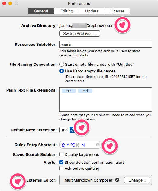
 The Archive Preferences General
You can specify the location of your Archive folder. It can be a Dropbox hosted folder. That enables you to have the same collection of text files available across devices.
You can set a default note extension to use for your notes. Some people like using .txt, I am more comfortable with .md. Sublime Text 3 handles my .txt files. While Composer handles my .md or Markdown files.
The Archive lets you set a keyboard command for the global Quick Entry Shortcut. Also lets you assign an external editor of your choice , if you desire.
 The Archive Preferences Editing
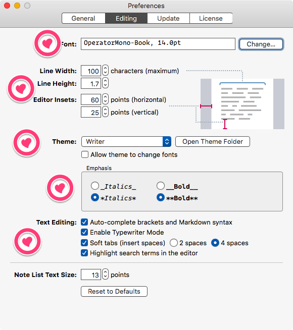
In the Editing panel of The Archive’s Preferences you get to assign the font you want to write in. You get to control line width and the line height. You also get to control the amount of space around your text through the Editor Insets control.
Choose a theme. Define the markup for italics and bold. I like typewriter scrolling and am glad to have that available in The Archive.
Some Random features/thoughts
Note ID. I have always used descriptive file names for my notes. For instance, I might have a file called “Info - The Archive keyboard commands,” which contains the keyboard commands which are available to me in The Archive. This system lets me have an alphabetically sorted list of notes on the sidebar. It is kind of an inefficient way of finding the file that I am interested in. When the archive of notes grew, I decided to include tags in the files. Tags help me collect similar files together and also lets me search my archive based on the tags. That is what I have been using till The Archive came along.
To create links between notes, you need to define how to target a note first. One response is to use file names. If you want clickable links the full path to the note could be used. However this is a fragile solution. It breaks when file names change or the location of the file changes. A better answer is to use an unique ID for each file. The Archive uses a timestamp ID. These timestamp IDs are by definition unique. For instance the timestamp ID 20180314211534 is based on the date 2018-03-14 and time 21:15:34. This is unique to this ID. If you name a file based on the timestamp ID, it will have an unique ID. Thus it will have the ability to be linked to by enclosing the ID in double brackets, which is how The Archive extends the ability of text files to link to other files. Try it, it is absolutely magic.
Changing List Type. You can create a list and change your mind about the kind of list you want. For instance, you have an ordered list. Highlight the list and select Format>Switch List Type or, press ⌘T. It changes to plain body text. Press ⌘T again, it changes into an unordered list. Neat and useful.
Tags. I love the implementation of tags in The Archive. The act of being clickable makes the tags useful and something that I have grown to rely on.
External Link URL Schemes. The Archive supports the following URL schemes:
- thearchive://search/TERM searches for TERM as if you typed it in
- thearchive://match/TERM works like the search but displays a good match directly; this is similar to Wiki-Links.
- thearchive://matchOrCreate/TERM will create a note of the exact title TERM if that doesn’t exist; it’s similar to entering a search term into the Omnibar and hitting the return key.
Scripting and automation experts can add Alfred workflows and Keyboard Maestro macros to talk to The Archive directly.
The Roadmap. The developers of The Archive explicitly make available on the product web site the roadmap for the product. Here: The Archive Roadmap • Zettelkasten Method. This transparency is rare and appreciated.
An explicit published roadmap lets the user know what the future of the product holds in store. I wish more software development houses were this candid and open with their users.
Resources. The Zettelkästen forum is a great resource for all things Zettelkästen. I have been learning from the other users of the forum for the past few months and it is a great resource for anyone interested in trying to optimize their use of notes.
Areas for improvement:
Any version 1.0 product has room to grow, and these are my suggestions.
- Highlight a word and paste an URL to create a Markdown formatted link.
- Support CommonMark or MultiMarkdown.
- A keyboard command to input header levels.
- Bring explicit support for Markdown tables into the editor. Integrate your other product TableFlip into The Archive or let those two talk to each other.
Conclusion
The Archive blends the power and simplicity of nvALT with the elegance and efficacy of a digital Zettelkästen system to bring order and clarity to your note-taking system.
I have been using The Archive for the last few months. Being a part of the beta program (I am the anonymous one) has given me an appreciation for the progression of the product, the dedication of the developers and the humanity of the community surrounding the product. I am honored to be a part of this exceptionally bright and generous community.
The product is well designed and efficient. The developers are responsive and thoughtful.
If you are serious about your note-taking, you need to give The Archive a trial. I recommend the product heartily.
Acknowledgement
Some of the material, specially the section on Zettelkästen is copied from the help files that Christian, one of the developers of The Archive wrote during the beta period.
macosxguru at the gmail thingie
Note-taking
Zettelkästen
macOS
February 21, 2018
WonderPen Is a Tad Short on Wonder
 WonderPen Icon
Product: WonderPen
Price: $9.99
WonderPen is another Markdown based text editor. It is from China.
One sentence review: It reminds me of Ulysses without all the attention to detail.
At the base, it is a Markdown based text editor. It is an Electron application. For those who care about that, it might be a deal breaker. For those who don’t, this is an interesting product which lets you write on the Mac.
Like Ulysses and Bear it keeps its documents in a proprietary database and unlike them, it doesn’t have an online component. No explicit Dropbox sync, no iCloud sync. Just a folder on your hard drive where the database resides. I suppose you can put the database in a Dropbox folder and access your documents through a second macOS device using WonderPen but I haven’t tried that out.
It has some nice touches and some glaring omissions.
What WonderPen Delivers
 WonderPen 3 Pane
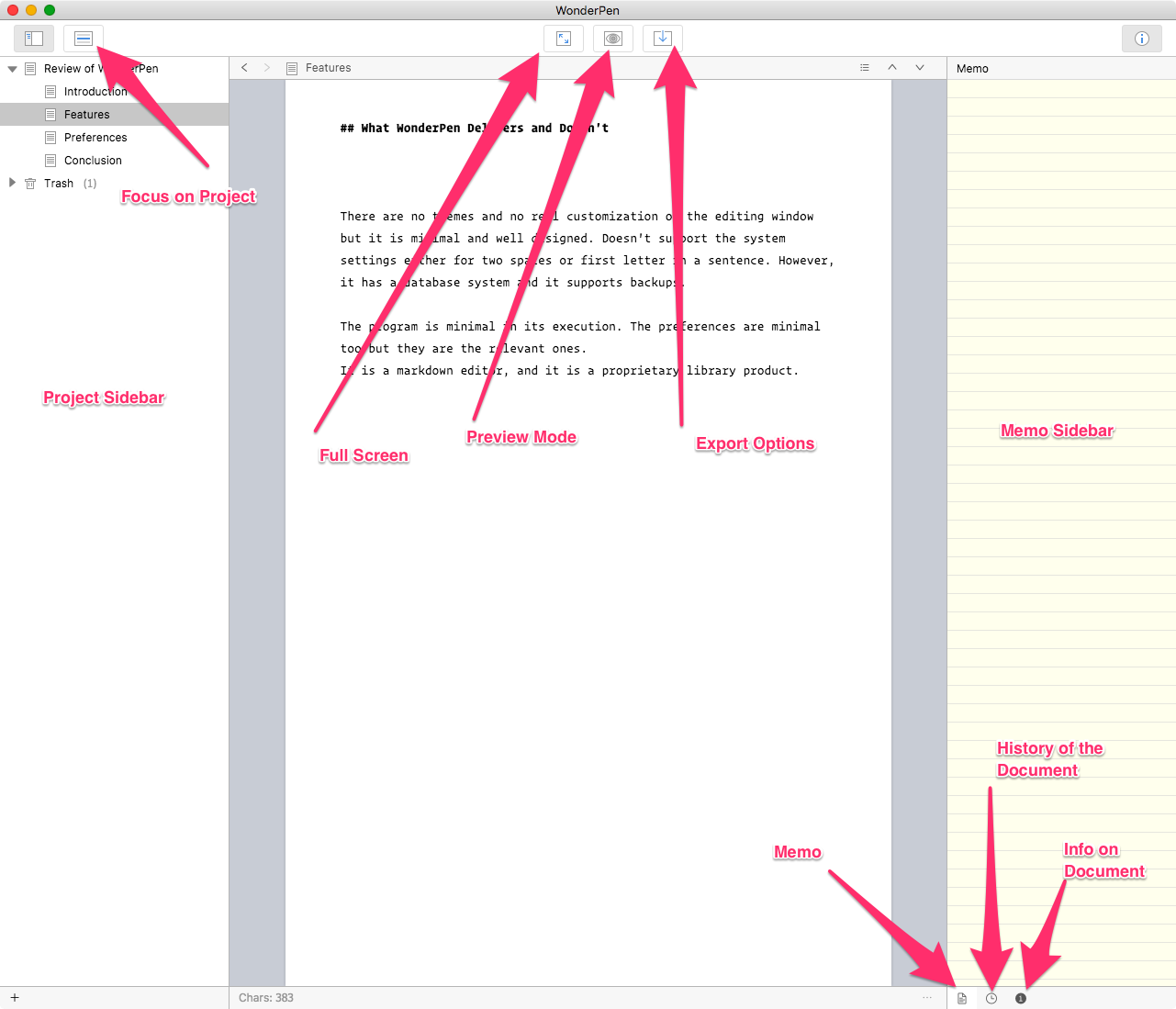
WonderPen gives you a three pane window to write in. The sidebar on the left contains your document hierarchy. The middle window, the editing window, and a memo window to the right. Every document in WonderPen has the ability to have an assigned Memo window where you can comment on the document and the content for your own reference. It is a nice touch which reminds me of a similar feature in Scrivener.
You can preview your markdown and there is an usable full screen implementation.
The left sidebar is the project sidebar, you can toggle this on and off (⌘1). Like Scrivener and Ulysses, WonderPen gives you the ability to write in small chunks. You can have a folder which contains parts of an article you are writing. So, you don’t have to write it all in one document.
 WonderPen
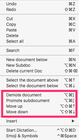
You can move these component parts around by drag and drop or by keyboard commands. This makes the process of writing a long document and arranging it easier. This is important when you export the document, the export stays true to the hierarchy of files you have created.
If you have a ton of projects in the sidebar, you can reduce distraction by focusing on the project you are working on.
You can save snapshots of your work from a particular state and return to that state. The snapshot history is accessible from the button on the right bottom corner.
 WonderPen Dark Mode
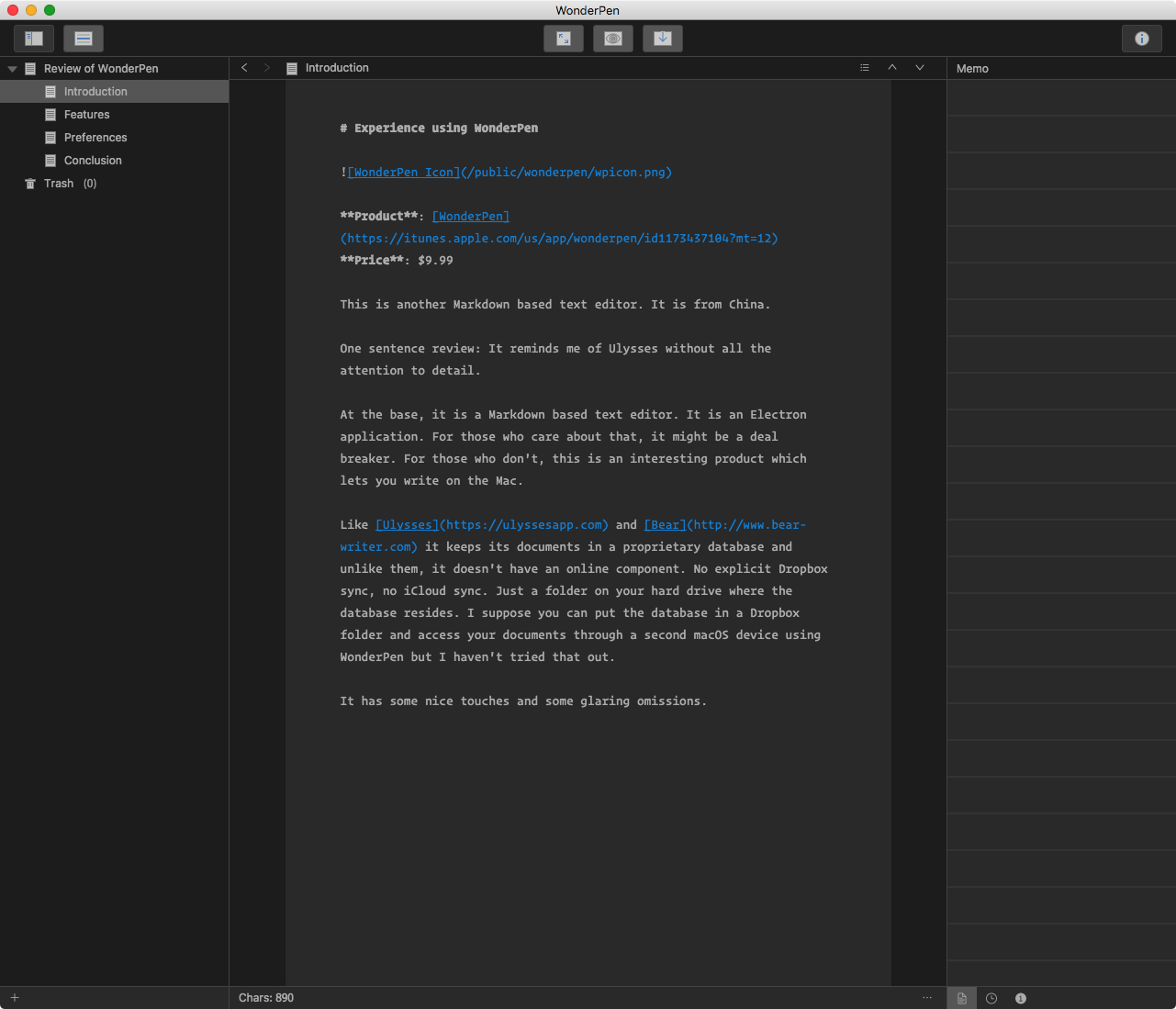
There is a dark mode and a light mode, but there are no themes or syntax highlighting in code blocks.
For an application which keeps your files in a proprietary database one of the important things to consider is how to get your documents out of the program.
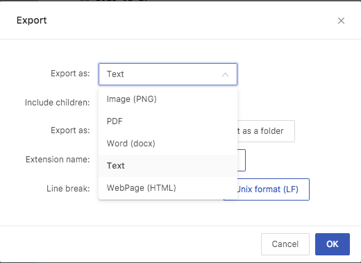
 WonderPen Export 1
WonderPen has a comprehensive set of exporting options, you can export to a PNG file, a PDF file, word document (docx), text, and HTML file.
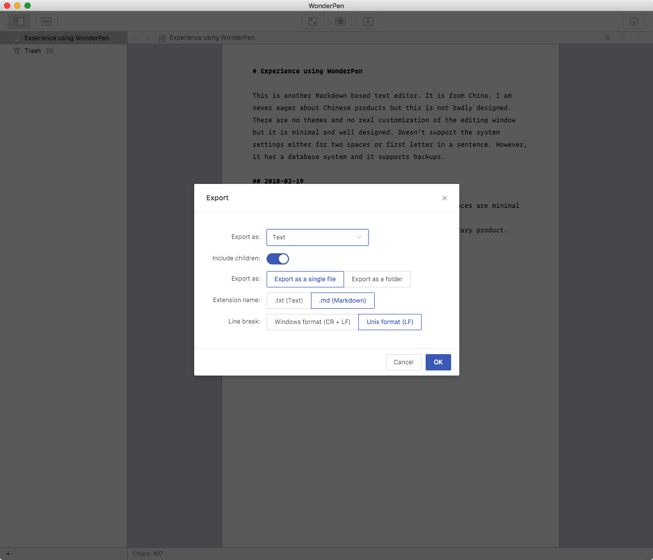
 WonderPen Export 2
I am interested in the text export and WonderPen does a great job of that. Giving me ample choices to make the product usable.
What WonderPen Doesn’t Deliver
In random order of importance, things WonderPen doesn’t do:
- Keyboard commands for Markdown. Yes, it does bold (⌘B) and italic (⌘I), but it doesn’t support anything else.
- WonderPen doesn’t automatically let you continue an ordered or unordered list. The whole process is manual.
- WonderPen doesn’t support the autocompletion of brackets that makes Markdown writing easier. Nor does it make any effort to make it easier to include URL links in your documents.
- While it supports a well implemented full screen mode, it doesn’t support typewriter scrolling.
- Doesn’t support any form of spellchecking. There is a perfectly usable spell check function built into macOS, but WonderPen doesn’t support that.
- WonderPen doesn’t support text expansions built into macOS. Two spaces for a period or start every new sentence with a capitalized letter are not supported from the macOS system. This is disappointing because Caret which is also an Electron app does support the system features on macOS. So it is doable, WonderPen doesn’t care about supporting those features.
- No support for Services, another aspect of macOS which makes it special and convenient to work in.
WonderPen Is Minimal in Its Preferences
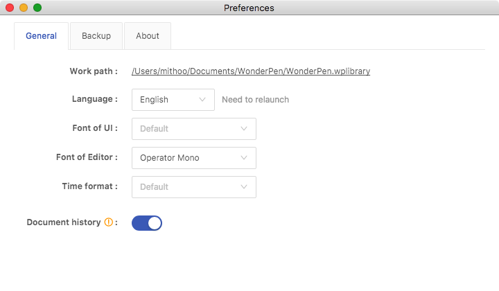
 WonderPen Preferences 1
You can assign a folder for WonderPen to keep its database. You get to choose the font of the editor and the font of the UI.
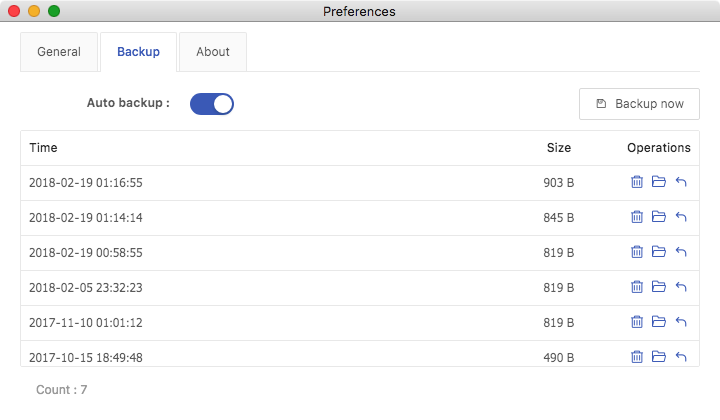
 WonderPen Preferences 2
You get to choose to automatically backup, manually backup right now and access your backups through this preference pane.
Conclusion
WonderPen has promise. In its current iteration, is only a good place to write in if you are comfortable with Markdown. Otherwise there are better options available to you in the marketplace.
I liked the minimal ethos to the program. I like the approach to ordering your document contents through the sidebar and then exporting it out. The export options are adequate and I love the attention WonderPen lavishes on backups. Using the app to write this review I am enamored by its spartan UI. I find the lack of distractions helps me write.
The price is $9.99. Compare that to its more illustrious competitors: Bear costs $14.99 a year and Ulysses, costs $39.99 a year. WonderPen is not feature competitive with those products, but it has a similar three pane structure with the focus being on writing in text. WonderPen is the cheaper alternative. It is nowhere near as good as the competition but it is perfectly usable.
What is holding me back from giving WonderPen a full throated recommendation?
- The writing environment lacks polish. It lacks the care I associate with Markdown editors. No support for keyboard commands, no attempt to make Markdown writing easier. It performs more as a text editor and less as a Markdown editor.
- The support web site is in Chinese with a few English words strewn about. There is no way for a non-Chinese speaker to know the abilities of the program. There is essentially no documentation available for the non-Chinese speaker. If you make the app available in the US app store, it is a good idea to provide some English documentation.
- I personally wrote to the developer a week ago. No response yet. There might be a language barrier. But it does not fill me with confidence about the support for the program.
So, what does one say about WonderPen?
I like it. It does give you a platform to write in. Expect to write all of the Markdown syntax yourself. The library function is well implemented. The security of the data is explicitly maintained and supported. The export options are adequate. The memo function for every document is a nice innovation. The program has promise with some caveats.
It has a light version available for you to try out the product. Here. You can take it out for a test drive.
WonderPen is recommended for those on a budget.
Update: I heard from the developer of WonderPen. He says that improvements are coming. I am excited about the future of this application.
macosxguru at the gmail thingie
macOS
Writing
WonderPen
February 12, 2018
Quick and Easy Scratch Pads
Product: Tyke
Price: Free
Product: Scrawl Product Link: Mac App Store Link
Price: Free
Product: Airnotes
Purchase Link: Mac App Store Link
Price: Free
Product: FiveNotes | Apptorium Purchase Link: Mac App Store Link Price: $4.99
During your work on the computer there are little things which you need to keep a record of. The expectation being that you are going to get to it a later stage. It is the quintessential sticky note solution. You have to keep a record of it, copy and paste it, accessible and available to you when you need it. These are programs trying to solve that problem for you.
I have written about this category of products before:
In this article I am going to cover four more.
Tyke
 Tyke Icon
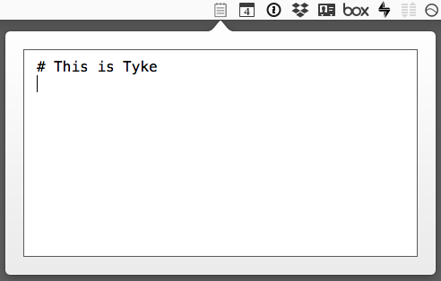
The developer of Tyke describes it as “A little bit of scratch paper that lives on your Mac menu bar.” It is an apt description for a program which is focused on its single task: providing you a little window to type your note into. No preferences but one, and a strange one at that, you can enable/disable smart quotes, nothing else. This is the most basic of the four products I am going to describe in this article. It is free. It does what it sets out to do and is a treat to work in.
 Tyke Window
This is recommended if you are looking for the most basic implementation of a note-taking window.
Scrawl
 Scrawl Icon
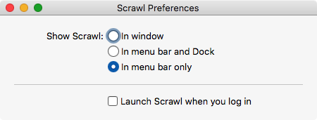
Scrawl is a more complete product than Tyke. For one, it has an iOS counterpart, called Scrawl Notes. It has iCloud syncing built in and it has preferences. Okay, the preferences are minimal:
 Scrawl Preferences
It gives you the choice of where you want Scrawl to show up: menubar, dock or both. You can setup Scrawl to launch when you log in.
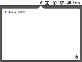
Like Tyke, Scrawl gives you a single window to type in.
 Scrawl Window
Focused on a single task, this is a well-designed application and the added benefit of syncing the contents of the singular note across your devices makes this useful.
Simple, elegant and useful. Scrawl is highly recommended if you want your note to be available on both your macOS and iOS devices.
Airnotes
 Airnotes Icon
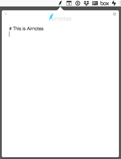
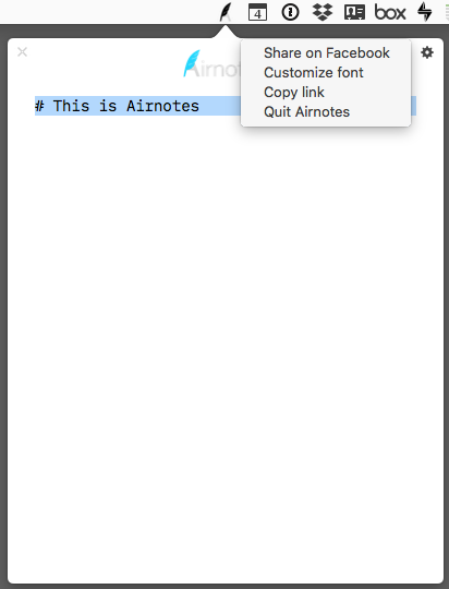
Airnotes is another of these one document note-taking apps which reside on the menubar. Like Scrawl, it saves its documents in iCloud. The sync is waiting to be completed by the launch of the iOS version of the program.
 Airnotes Window
Unlike any of the other options listed here, Airnotes lets you choose your own font from your list of installed fonts. This alone makes it makes it more usable to me.
 Airnotes Preferences
The rest of the preferences are somewhat strange. You can post the content to Facebook. I have not tried this feature. You can copy a link to the product from the App Store from this preference pane. The link points to the Mac App Store.
Airnotes won me over with the ability to choose my own font, but besides that this is indistinguishable from any of the other offerings. Till it launches an iOS version, this is constrained by being a macOS only solution.
Airnotes works and is efficient. Recommended if you are currently looking for a macOS only solution and font choice is important to you.
Five Notes
 Five Notes Icon
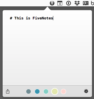
Five Notes is the only commercial app in this round up. It is distinguished by giving you five note spaces instead of one.
 Five Notes Window
Five Notes has some features which make it compelling:
- Five Notes has the ability to manage five different notes. You switch between the notes with ⌘+(number of note).
- Supports the share extension built in to macOS.
- Supports the basic elements of Markdown, headers, bold and italic text, quotes and lists.
- Unlike the others in this list, this implements a user selectable keyboard command to get to the editing window without having to tap icons on the menubar.
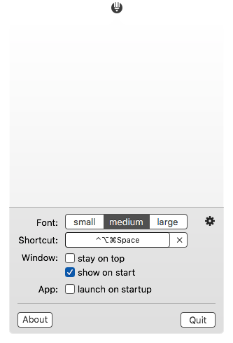
 Five Notes Preferences
Five Notes has a set of preferences which make the product useful:
- Five Notes doesn’t give you the ability to use your own fonts but it does give you the ability to choose the size of the font display.
- Lets the Five Notes window stay on top and display/hide its window at start.
- Gives you the option of launching Five Notes on startup.
Five Notes is the most accomplished of the products in this collection. It is distinguished by its support of Markdown and its provision of five editing windows instead of the single one of its competitors.
If you are going to be using a scratchpad, and don’t mind spending $4.99 for that task, Five Notes is the product I heartily recommend.
macosxguru at the gmail thingie
Tyke
Scrawl
Airnotes
Five Notes
writing
December 28, 2017
Favorite Mac Applications for 2017
I am going to cover some of my favorite applications of the year 2017. I am primarily a writer, which means that the bias of the focus will be on apps which I use to write. Let’s get started:
MultiMarkdown Composer Does Markdown Better
MultiMarkdown Composer reached version 4.0 and took over all my writing in Markdown. Customized for writing in MultiMarkdown. Full of little touches which make writing an absolute pleasure. Designed well, implemented perfectly, this is the product which made my 2017 exciting and fun. I wrote about it here.
Bear Conquers Note-Taking
If I was to design the ideal note-taking application, it would look a lot like Bear. It was my App of the Year for 2016 and over the year 2017 Bear has improved on the product to make it an ideal note-taking application. New themes, multi-word tags, infinite tag nesting, tag auto-completion, has enhanced the experience of note keeping in Bear. The only thing it lacks at this point? Typewriter scrolling. This is a feature which developers who write code don’t seem to appreciate as much. For a writer, this is a must-have feature. There are two products I use which are constrained by the absence of typewriter scrolling, Bear and BBEdit. They both suffer from that.
iA Writer Manages Your Files and Introduces a New Font
iA Writer has upped its game with the ability to manage your text files in their assigned folders. iCloud support to facilitate the cross-device access to your text files. The ability to add images, and content blocks makes iA Writer an amazing Markdown based text editor. I have written about it here and here.
iA Writer is iconic. Defined by its use of a customized version of Nitti, and the blue thick cursor, the developers of iA Writer introduced a new font to the mix. They wrote In Search Of The Perfect Writing Font – iA, and gave the community iA Writer Duospace. Duospace is my working font in all applications which give me the ability to choose my own font, including iA Writer.
Ulysses Rides the Subscription Wave
Ulysses introduced subscription pricing and it’s user base divided into two camps:
- Ho hum. Here is my money.
- You barmy?
The product continues to evolve. One of the best environments to write in, it is enhanced with the support for Paste from Markdown and Copy as Markdown. These two commands has made it easier to work in Ulysses if you are writing exclusively in Markdown.
One of the arguments for the switch to subscription pricing was the issue of product development. In the old revenue model, important features were held back to be combined into a compelling case for upgrade revenue. In the subscription model, there is no need for such restraint. Features big and small can be rolled into the product when available. I am awaiting table support.
Scrivener Upgrades to 3.0
If you are serious about writing, you have to try Scrivener. They recently introduced version 3.0. It brought with it, a whole host of features and improvements. For me, the important ones were:
- Completely redone compile.
- Amazing support for MultiMarkdown built in.
- Complete modernization and overhaul of the interface.
Scrivener is one of the applications which you can live in. Everything you do in the domain of writing can be handled by Scrivener. I use it for long form writing.
Keyboard Maestro and Alfred Keep Growing Up
Keyboard Maestro released version 8.0 and Alfred went up to 3.5. These are two products which make my computer run. I use them all the time and I can’t imagine using a Mac without these two programs being installed.
Though these get a lot of use on my computer, I find myself struggling to explain what they do for me. It might be that they do so much that it is difficult to explain. They do everything. In no particular order these are only a subset of tasks they perform for me.
- Launch programs
- Open documents with particular programs
- Open a set of programs when I first switch on the computer. Open a different set of programs when I work on some other task.
- Open a set of URL’s when I am in one project and open a different set of URL’s when I am on a different project. Open a set of URL’s when I want sports news, and a different set of URL’s when I want political news.
- Select a set of files and perform some action on all of them at once. For instance, select a set of compressed files in the Finder, decompress them and then move to trash the original compressed files.
- Start a timer.
- Have a set of keyboard commands which let me write in Markdown irrespective of which editor I am using.
- Empty trash without leaving the keyboard.
- Use typed strings to perform actions in applications. For instance, in Ulysses, to switch to editor only view, I can type,
,edit. To show the library? Type ,libr.
- Expand snippets of text into pre-set boilerplate text. Alfred and Keyboard Maestro handle all the text expansions which I used to use with TextExpander.
This is not an exhaustive or comprehensive list of things I do in Alfred and Keyboard Maestro. These two programs are essential to my workflow. They are improving all the time and the communities around the two are enhancing the product with macros and workflows which make life easier for other users.
Outlining with OmniOutliner
OmniOutliner with version 5.0 decided to appeal to much lower price points. $9.99 for the Essential version and $59.99 for the Pro version made it possible for the product to appeal to a broad swath of consumers. Feature rich, extremely customizable (more the Pro than the Essential), and dedicated to outlines in all their glory, this is a deep product which is always launched on my machine. I love lists and OmniOutliner is where I create them.
OmniOutliner helps me think through things. Decisions have different elements to them and an outline helps me put it all together and evaluate different courses. Which brings me to the next application.
Curio Helps Me Think Things Through
Available in versions ranging in price from $59.99 to $139.99 Curio is an unique program. Mind maps, Lists, Index Cards, Tables, Stacks and Pinboards are all tools which are available in Curio. This is the program which does it all.
I live in Curio. I use it whenever I have to think things through. I use it when I find myself stuck. I start thinking in it, and having no clue where I am going I start putting the random thoughts in my mind in to Curio. Over time, the picture clarifies and if I am lucky, a path comes out of this exercise. There are times when I am not stuck but it is just the opposite, I have too many ideas. It is as harmful to my productivity. I use Curio to show me the way. I start writing in it, I don’t think too much, I use the tools to get into Curio the random ideas in my head. The act of writing them down in Curio, clarifies them, simplifies them, helps me break it down to the essence and that gets my mind sorted out and gives me direction and clarity.
Curio is better than a mind map solution like MindNode or iThoughtsX because it does more. It doesn’t restrict me to mind maps only, it gives me tools like lists, tables, index cards and others to fit my thinking into. That makes the process easier for me. I can make lists in Curio, I can make mind maps in Curio. Sometimes what I am thinking about is better handled by a table. No problem. Curio does that for me. I love Curio. I wrote about it here.
However, if you are looking for a mind mapping application both MindNode and iThoughtsX are very decent solutions for that need.
myTuner Radio Pro Keeps Me Connected
myTuner Radio Pro is a radio/podcast application available from the Mac App Store. I find myself listening to radio from England and India in it. It reminds me of the shortwave radio I used to listen to in my youth in Calcutta. I had to turn the dial and catch snippets of whole programs from the BBC, or the VOA, commentary on cricket test matches played in Barbados, Wellington, or Melbourne. It was exhilarating hearing sounds from far away, and accents which made my sing-song Indian english appear strange even to me.
myTunerPro is the modern day equivalent of the shortwave radio. You don’t need to have minute control over the dial, the antennae need not be powerful, myTunerPro just sits on the menubar giving you access to 40,000 radio stations from 200 countries. It also gives you access to podcasts from all over the world and is always playing something on my computer.
SuperDuper! Lets You Be Safe and Clone Your Hard Drive
I use SuperDuper! to clone my internal hard drive to an external one. It has been working like a charm and gives me the ability to have a bootable backup of my system always available.
People I trust tell me that Carbon Copy Cloner is also very good at this task. I use SuperDuper!.
Both of these programs do the same thing. Gives you the ability to create a bootable clone of your hard drive. After you clone the hard drive the first time, you have the option in both programs to do incremental backups. Incorporate into your clone all the changes that have occurred since the initial clone. This takes a fraction of the time of a full backup. Both of these programs are heartily recommended and are a necessary component of my backup strategy.
Conclusion
We are lucky in the macOS space to have such great products available to us from some good developers. I thank them for making my life better.
Thank you all.
macosxguru at the gmail thingie
macOS
![]() MWeb Icon
MWeb Icon MWeb Interface
 Keyboard Maestro macro to toggle toolbar
 Keyboard Maestro macro to toggle dark mode
 MWeb Document Outline
 MWeb Table Editor
 MWeb Blogging
 MWeb Export
 MWeb Backup